
Hyeongjun Kim


As a UX designer, I explore how people can experience emerging technologies in intuitive, accessible, and safe ways, with a focus on UX research that enhances experiences across mobility, products, and services.
As a UX designer, I explore how people can experience emerging technologies in intuitive, accessible, and safe ways, with a focus on UX research that enhances experiences across mobility, products, and services.

Nowadays, most of the traditional physical buttons on the dashboard in the vehicle have been replaced by touchscreen-based in-vehicle information systems (IVIS) to handle the increasing number of features in IVIS (Ahmad et al., 2017; Ng et al., 2017). However, there is a negative consequence that operating a touchscreen while driving often causes distraction, which can directly lead to severe car accidents (Walker, Stanton and Young, 2001). Existing research has pointed out the importance of reducing driver distraction while interacting with the touchscreen-based IVIS and has suggested adopting customisable or context-adaptive (AI) IVIS interfaces to reduce distractions while using the touchscreen (Normark, 2015; Walter, 2019). However, there is a lack of research on which of the Customisable and Context-adaptive (AI) IVIS UIs is more effective in reducing driver distraction compared to conventional static IVIS UI.
To address this gap, this study investigated the effectiveness of Customisable and Context-adaptive (AI) IVIS interfaces in reducing driver distraction and enhancing usability, compared to conventional touchscreen-based Static IVIS UI.
The research addressed three questions.
This research adopted the design thinking process (Hasso Plattner Institute of Design at Stanford University, 2010) to develop prototypes and evaluation methodologies.

To evaluate the effectiveness of Customisable and Context-adaptive (AI) IVIS UIs in reducing driver distraction and enhancing usability, compared to Static IVIS UI, three different types of prototypes were designed. The first prototype was a customisable IVIS UI which allowed users to freely customise the order of feature icons in the menu panel and fix the icons in the bottom bar based on the user’s preferences. The second prototype was the Context-adaptive (AI) IVIS UI that suggested the feature icons based on the context by showing more relevant features in the first order using AI to understand the real-time situation. The last prototype was a static IVIS UI that showed a fixed list of feature icons in alphabetical order to compare the effectiveness in driver distraction and usability with the other two prototypes. Each prototype in the study was designed using the elements and layout of Tesla Software Version 12 UI.
This study adopted a within-subjects design to minimise the impact of the participants’ individual characteristics, such as driving skills and familiarity with the position of the steering wheel, on the reliability of the evaluation results. Thus, each participant interacted with all three prototypes. To reduce the ‘Learning transfer effect’ across the three prototypes while the participants evaluated them one by one, the evaluation order of the prototypes was randomised using Latin Square counterbalancing.
Twelve participants were divided into three groups to follow the prototype evaluation order. Participants were required to be aged over eighteen and to have prior driving experience to facilitate the smooth execution of the experiment with the driving simulator. Individuals with a history of driving sickness were pre-screened since those who experience motion sickness in real-world driving are more likely to suffer from simulator sickness (Hein et al., 2023).

For testing the three types of IVIS prototypes, three different task sets were prepared, since each participant was required to test every prototype. Each task set was designed to maintain an identical workload by including similar sub-tasks in randomised order, by following Latin Square counterbalancing. Each sub-task addressed one of three feature categories: media, communication, and car control. The task sets were assigned according to the test sequence of the prototypes.


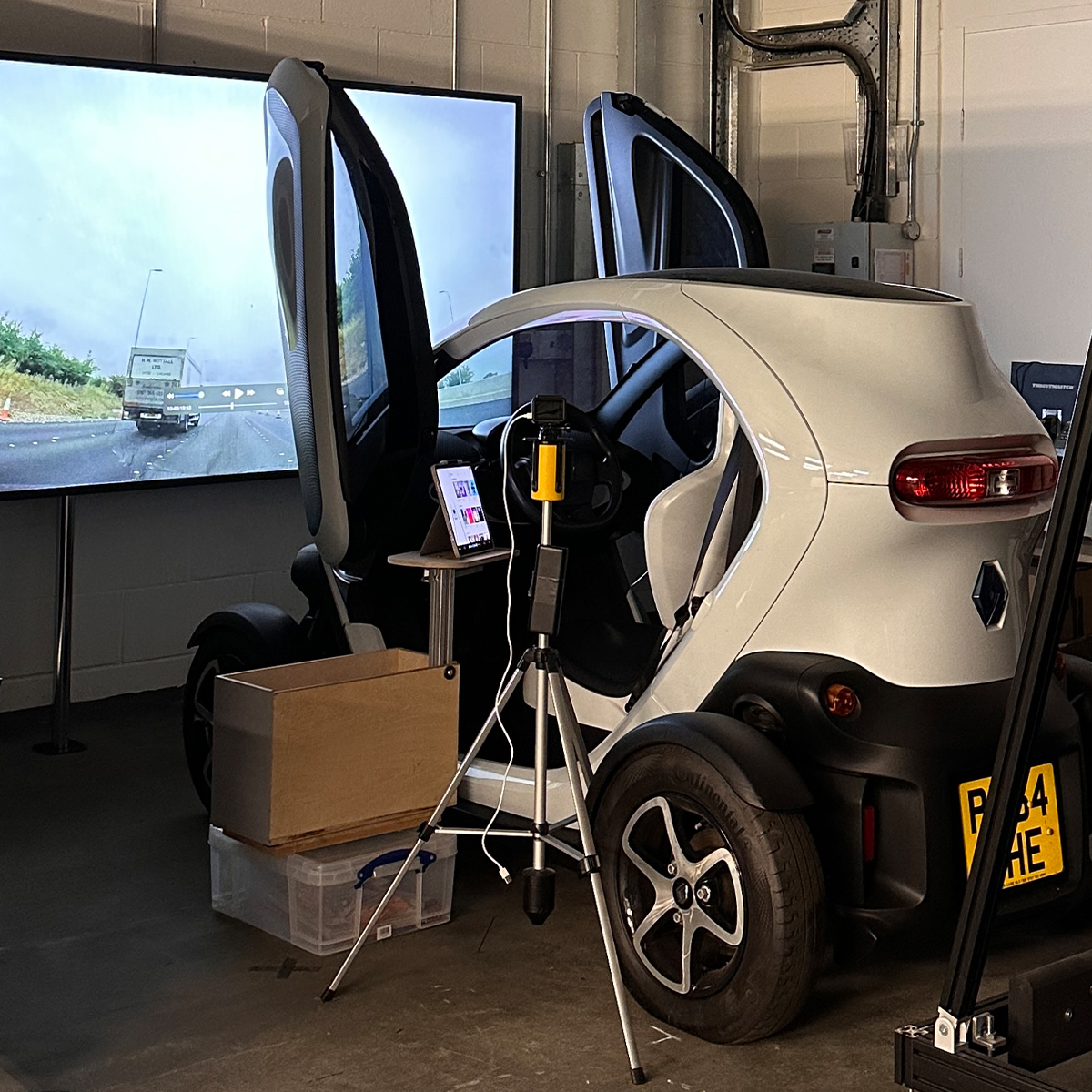
The evaluation was conducted in the driving simulator to examine prototypes in the driving context. The simulator consisted of a Renault Twizy and a 98-inch TV screen. A 12.9-inch iPad was fixed to the left side of the steering wheel as the IVIS touchscreen, aligned with the UK driving position standard. The GoPro was mounted on the left side of the vehicle to record the video of the screen and the participants’ hand movements. The simulation video utilised a driving scenario of a UK motorway.
To collect quantitative data for the research questions, three instruments were employed: NASA-TLX for mental workload, task completion time for objective usability, and the System Usability Scale (SUS) for subjective usability. The data were analysed first descriptively, reporting the mean and standard deviation. To evaluate statistically significant differences among the three prototypes, the Friedman test and Wilcoxon signed-rank test were conducted, as the Shapiro–Wilk test indicated that the data were not normally distributed. For significant differences, effect sizes were also calculated to assess the magnitude of the results.

Qualitative data were collected through the exit interviews to understand participants’ subjective experiences and perceptions of the prototypes and to gain a deeper understanding of the quantitative data. The interview questions were as follows.
The analysis combined deductive and inductive thematic approaches. Initially, quotes related to mental workload and usability were collected, and new codes were generated based on these quotes. The codes were categorised into sub-themes and then synthesised into themes using an affinity diagram. The finalised themes were translated into design implications to enhance usability and reduce mental workload while operating the IVIS.

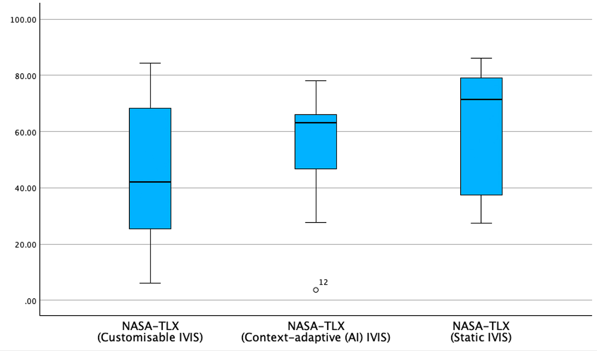
The descriptive statistics of NASA-TLX showed that the Customisable IVIS UI had the lowest mean score, and the Static IVIS UI had the highest. This indicates that the mean mental workload was lowest when using the Customisable IVIS. There were no statistically significant differences between the three prototypes (Chi-square = 4.667, p = 0.097). However, the comparison between the Customisable IVIS UI and the Static IVIS UI differed significantly with a medium-to-large effect (Z = -2.040, p = 0.041, r = −0.456).

The descriptive statistics of SUS showed that the Customisable IVIS UI had the highest mean score, and the Static IVIS UI had the lowest. This indicates that the mean subjective usability was highest when using the Customisable IVIS. There were statistically significant differences among the three prototypes with a small effect size (Chi-square = 7.478, p = 0.024). The comparison between the Customisable IVIS UI and the Static IVIS UI differed significantly with a large effect size (Z = -2.434, p = 0.015, r = -0.544).

The descriptive statistics of task completion time showed that the Context-adaptive (AI) IVIS UI recorded the shortest mean completion time, followed by the Customisable IVIS UI, while the Static IVIS UI required the longest completion time. There were statistically significant differences among the three prototypes with a medium effect size (Chi-square = 8.844, p = 0.012). The comparison between the Context-adaptive (AI) IVIS UI and the Static IVIS UI showed a statistically significant difference with a medium-to-large effect size (Z = -2.045, p = 0.041, r = -0.469).
10 out of 12 participants perceived that customising the location of the feature icons in the IVIS could reduce the mental workload and enhance efficiency when controlling features while driving. By placing frequently used features in more accessible locations and rearranging the icons based on their personal preferences, users felt less distracted and performed the secondary tasks more efficiently.
11 out of 12 participants indicated that familiarity and predictability are the key factors for their confidence and satisfaction when interacting with IVIS UI in driving situations. They felt frustrated by unpredictable changes in IVIS, as there are already many uncertain situations that can occur when driving.
Although many participants expressed a preference for the Customisable IVIS, there were positive opinions about the convenience of receiving suggestions from the Context-adaptive (AI) IVIS. Some participants described the context-based suggestions as particularly helpful when they needed to use features among the numerous icons they were not familiar with. These suggestions supported the participants in reducing the time spent browsing through menus.
Designers may enable users to customise the arrangement of feature icons in the IVIS UI, for example, by rearranging icons in the menu panel or pinning selected icons in easily accessible shortcut areas such as the bottom bar. Both quantitative and qualitative analysis provide strong statistical evidence of the Customisable IVIS UI’s superiority over the Static IVIS UI in terms of reduced mental workload and improved subjective usability.
To enhance user confidence and satisfaction, designers may offer more detailed customisation features, such as allowing users to create groups or categories in the menu panel based on their personal preferences and standards. The quantitative analysis provided statistical evidence that Customisable IVIS was effective in improving subjective usability and the qualitative analysis showed that the customisation of the layout of the feature icons was helpful for becoming familiar with the IVIS.
Designers may develop hybrid IVIS UI models by dividing distinct areas for customisation and suggestions. Users may fix frequently used features in easily accessible locations, while also receiving context-based suggestions in a designated area. In particular, placing these sections within a shortcut area, such as the bottom bar, may help users perform secondary tasks more efficiently with lower mental workload in a driving context. The quantitative analysis highlighted each advantage of Customisable and Context-adaptive (AI) IVIS prototypes, and the qualitative analysis showed participants’ preference for combining both IVIS UIs.