
Pengfan Qian


A human centred designer striving to leverage my digital media background, systematic thinking, and inclusive usability to craft intuitive experiences and drive meaningful behaviour change through simple, impactful solutions.
A human centred designer striving to leverage my digital media background, systematic thinking, and inclusive usability to craft intuitive experiences and drive meaningful behaviour change through simple, impactful solutions.

A service leveraging intelligent navigation and safety technologies to support older gig workers on motorcycles. It enhances risk prediction, emergency response, and riding control while promoting adaptability, dignity, and family connection—enabling a safer and more sustainable return to the workforce.
Click the video below to see how the Sandbox service works!

Motorcycles often carry a negative image, frequently associated with danger, noise, and even social stereotypes of recklessness or rebellion.
Beyond these impressions, motorcycles have made a significant contributions to human life: they provide affordable and efficient mobility, expand transportation access in developing regions, and even play vital roles in emergency response and medical delivery as well as combating carbon emissions. This is a powerful enabler of human connection and progress.
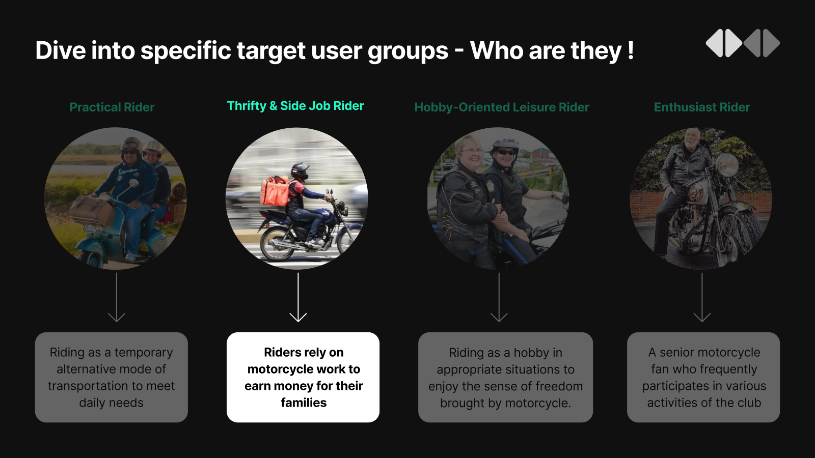
The user generally fall into four categories, For some of these groups, motorcycles are not just toys, it’s a life line for them.
Faced with the objective shortcomings of motorcycles, there is an older group of people with a decline in physical and cognitive abilities who seem to be unable to avoid intersections with the safety issues. These are user groups who survive by riding motorcycles under GIG economy. So how can we help them to improve their riding experience and reduce the potential dangers to rebuild their confidence?


Site Map of SENTRA APP
SENTRA APP Low-fi Iteration


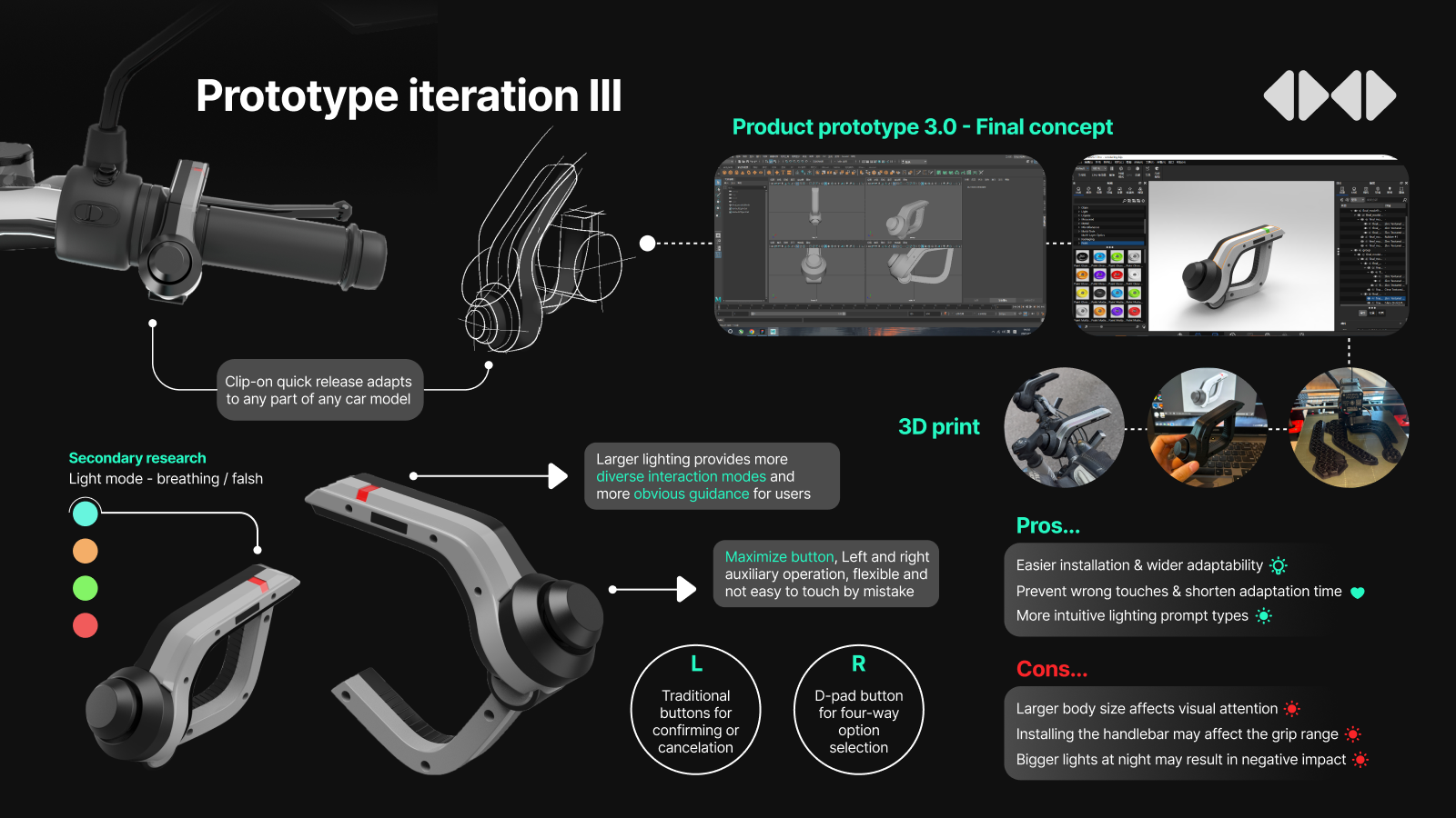

Paring Section
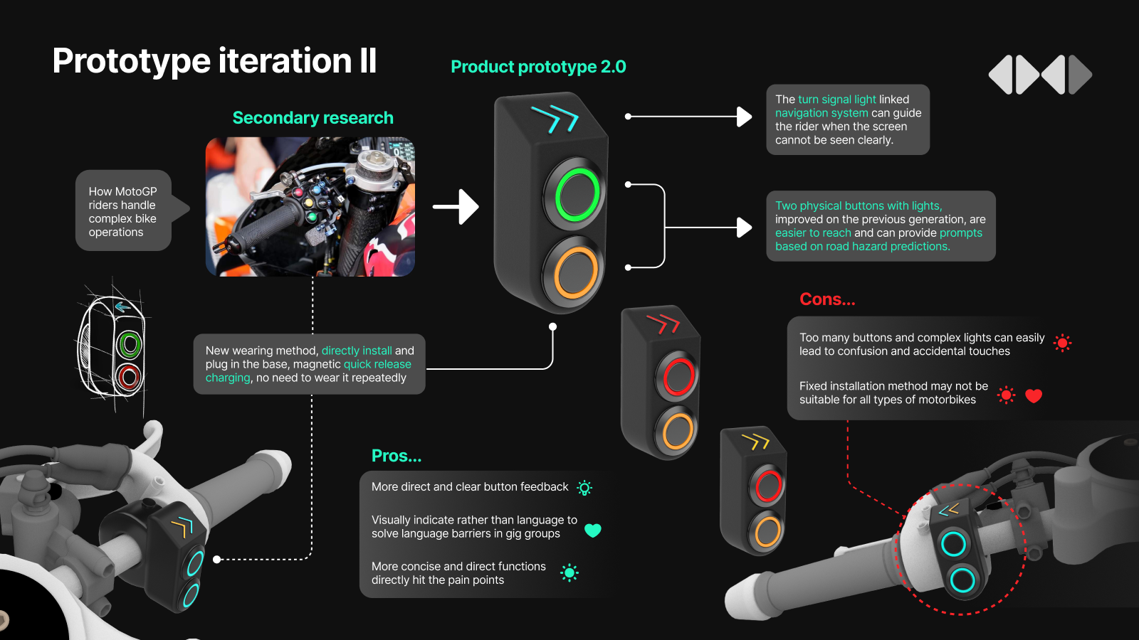
A magnetic quick-release mechanism allows riders to charge their products individually without the need for tools or frequent disassembly of the entire products. This is a matter of usability and sustainable considerations, not a subtle trick. They may not frequently turn up this interface, but once they do, they can easily find the setting they need.
Navigation Section
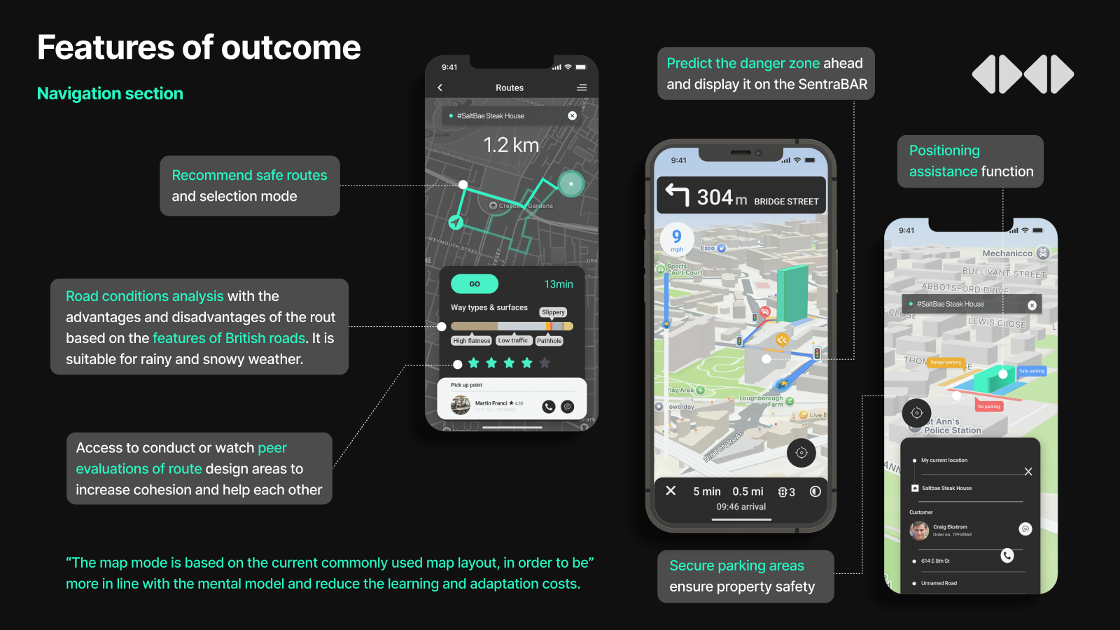
Safer route options — analysed against UK road conditions with clear trade-offs. The center one is the main navigation page, which not only provides visual hazard predictions on the screen but also alerts users through the SENTRABAR. Positioning assistance will save time which as a key factor to forces riders to take risks. Safe parking spots are often overlooked, leading to financial losses and compromised personal safety. Human-centred design is also essential.
User Assistance Section
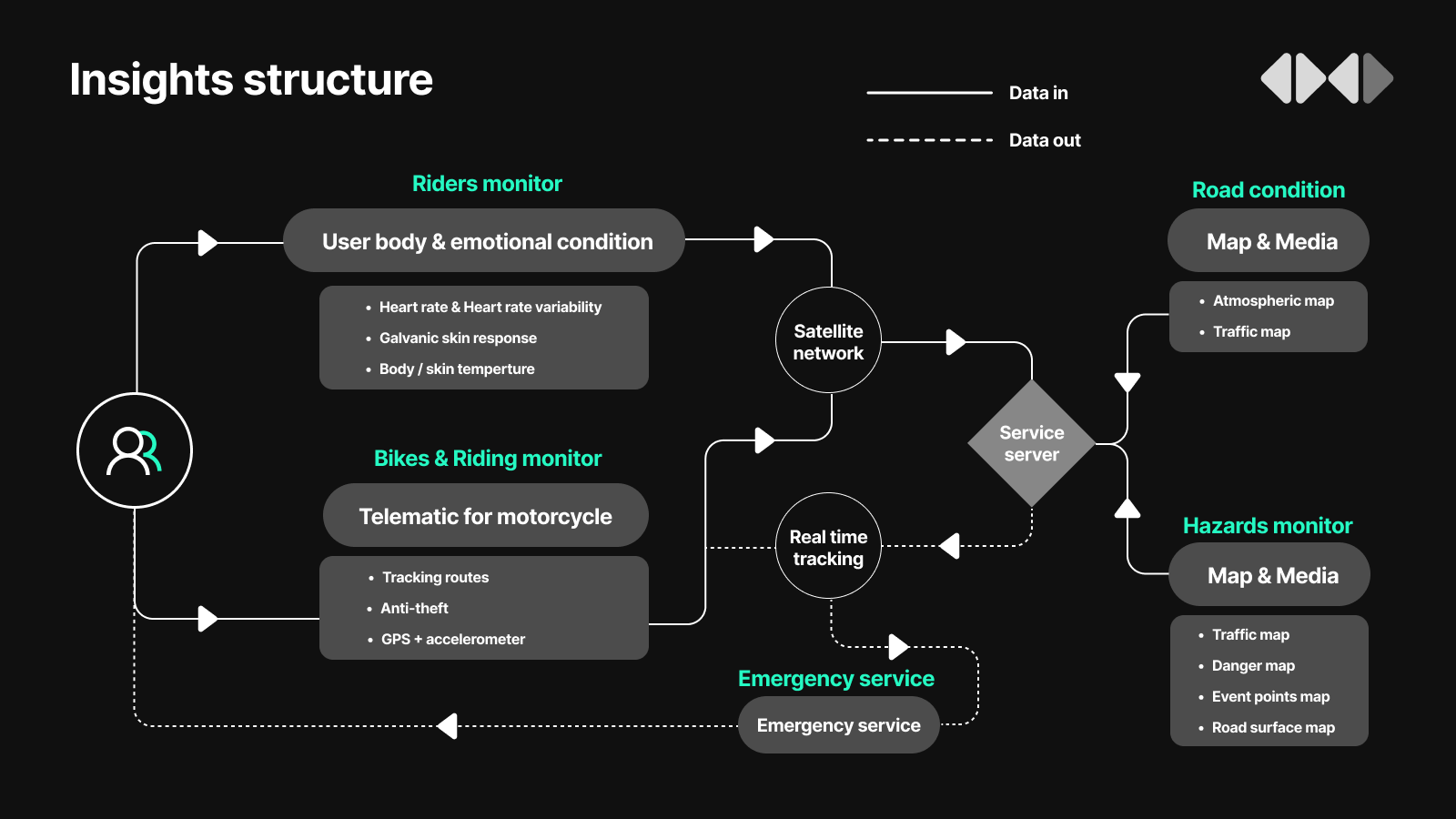
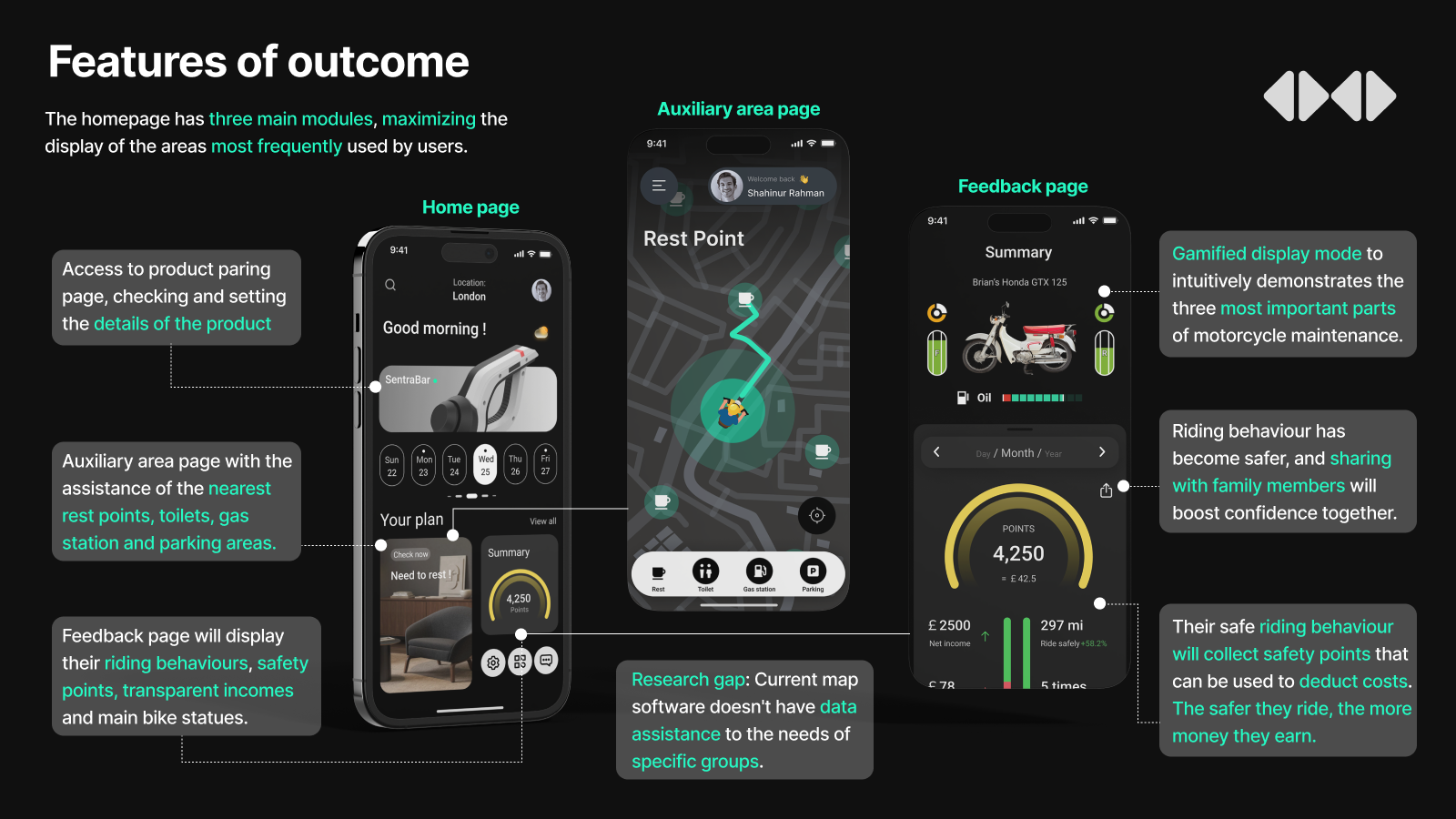
The homepage integrates Product Setup, Assisted Positioning, and User Feedback. Risk-prone maintenance items are flagged, while an AI-driven Safety Points system rewards safe riding with redeemable benefits. A visual footer highlights safety gains and transparent earnings, encouraging continued use. Data sharing with family enhances reassurance, fostering trust in safety, financial sustainability, and long-term technology adoption.
What if the worst happens…
If an incident is detected, the app triggers a countdown, if no cancellation is received, it auto-connects to the first responder for remote guidance and coordinates rescue. A progress-distance indicator helps reduce panic. In line with help-and-documentation heuristics, users can manually cancel for minor events or false alarms. I sincerely hope this screen is never needed.

As UX designer
I am a UX designer driven by a human-centred mindset, research-led methods, and systematic thinking. My process begins with framing meaningful topics, then zooming in and out to align user needs with wider contexts. By combining qualitative storytelling with quantitative data, I generate insights that are both empathetic and actionable. I communicate ideas clearly, refine them iteratively, and reflect critically on my practice. This balance of creativity and rigour allows me to design solutions that enhance usability, preserve dignity, and foster long-term trust between people, products, and services.
Ambitions as a UX Practitioner
I aspire to make a difference in the field of vehicle-driver interaction, focusing on improving the user driving experience through the design of an ecosystem of products and services. My goal is to create intuitive visual solutions, coupled with an inclusive ecosystem, to change the way people interact with mechanical vehicles, achieving a human-car interaction similar to that in the Pixar film Cars.
Personal Reflection
Even having gone through multiple iterations, opportunities for refinement were still needed. Data accuracy and reducing ownership costs are crucial for adoption among gig workers, while strategic partnerships with insurers, retailers, and rescue services could build a sustainable ecosystem. From a UX perspective, usability improves when products form a coherent service journey. I learned to frame safety not only as a technical problem but as an experience of confidence for riders and reassurance for families. This project reshaped me to design beyond individuals—considering wider stakeholders, ecosystem impacts, and behaviour-change strategies grounded in both practicality and empathy.